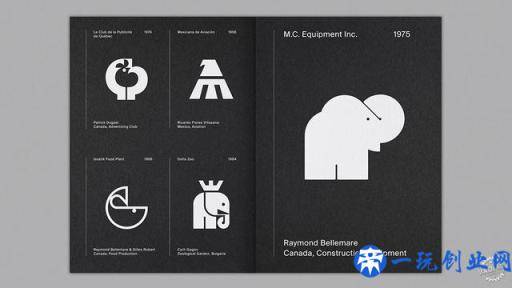
LogoArchive杂志讨论欧洲中世纪品牌的视觉语言
LogoArchive magazine explores the visual language of mid-century branding
由专筑网张鹏,李韧编译程序
Richard Baird编撰了一本季刊,以此来赞美世纪中叶的极简风格标示。在接受Dezeen记者的采访时,这名英国伦敦设计师选择了他最喜欢的五个著作。
期刊名叫“LogoArchive”,其来源于设计师的同名的Instagram账号,其中包含1,000好几个新世纪中期的logo设计实例。
Instagram账户的取得成功增强了Baird建立季刊的想法。第一期包含12页黑与白商标,从1975年为一家澳大利亚建筑工程公司设计的“美丽动人”小象,到1965年为德国潮流品牌Vogel制作的V形飞禽标志。
Baird告知Dezeen的记者说:“在本世纪中叶,正规的企业形象策划还处于起步阶段。我们有很多机会在保持不侵害他人的商标著作权与此同时,保持了商标的简单性和沟通及时性。”
LogoArchive杂志里的商标来源于Baird个人和别的设计师的作品。
Baird说:“很长一段时间至今,我一直在扫描仪和存档商标,是我与此合作的设计师互联网,她们手里有着珍贵的材料,尤其是LogoBooks的Christophe de Pelsemaker和CanadaModern的Blair Thomson。
“对于我个人来说,杂志里的全部标志都是有暗喻的特征,不仅有辨识度,也是有记忆能力,也有对家庭的恰当了解。”
Baird回答了杂志中最有趣的下列五枚商标。
Richard Baird has created a quarterly magazine to celebrate minimalist mid-century logos. Speaking to Dezeen the London-based designer picks five of his favourite examples.
Called LogoArchive, the publication accompanies the designer’s popular Instagram account of the same name, which features over 1,000 examples of mid-century logo design.
The success of the Instagram account inspired Baird to create the quarterly magazine. The first issue includes 12 pages of black and white logos, ranging from a “charming” elephant created for a Canadian construction company in 1975 and a V-shaped bird icon made for German fashion brand Vogel in 1965.
“The formalisation of corporate identity design was in its infancy during the mid-century,” Baird told Dezeen. “There were a lot of opportunities to keep logos simple and communicatively immediate without the potential of infringing on the trademarks of others.”
The logos featured in LogoArchive have been taken from Baird’s personal archive and the collections of fellow designers.
“I have been scanning and archiving logos for a long time, and I have a network of designers with whom I collaborate with, who have access to an invaluable volume of historical artefacts, in particular, Christophe De Pelsemaker of LogoBooks and Blair Thomson of CanadaModern,” said Baird.
“All the logos featured in the zine speak to me personally, be that in the conviviality of a metaphor, the retention of a distinction and memorability, or a clever take on a family symbol.”
Baird explains five of the most interesting logos featured in the magazine below.

Patrick Dugast设计的加拿大航空企业建设公司,1976年
该标识应用极少的原素表现了巨大的含义,设计师应用复合型方式表达出分层次的图型,并引入了形式语言2个瞬间的重合。
出色设计师可以发掘图象的发展潜力,与此同时能够将两张图象自然地合二为一,而该图象的设计师以有意思而富有创造性的方法捕获了红枫叶和鸟儿的部位。
Enterprise de Construction Aéronautique Canadienne by Patrick Dugast, 1976
Building on the maximum meaning with a minimum of means, compounding allows a designer to deliver a layered graphic expression and introduce two moments of form language.
Finding the potential for and being able to pull off a natural synthesis of two images is a mark of a good designer. Here, the bird and maple leaf capture location and flight in a playful and creative way.

Claude Plante设计的香水百合商业广场, 1972年
这个标志从而磨练了设计师的观察力,设计师针对连接形式的巨大创造力,设计构思了简易又很与众不同的作品。
设计方案意识的核心是将一种事情转变为另一种方式,通过对香水百合进行简单的几何图形3D渲染后产生完全不同的图象实际效果,这让人感悟到小鸟。
Place Fleur-de-Lys Centre Commercial by Claude Plante, 1972
This logo was selected for the designer’s capacity for observation, for link forming and effortless execution in the creation of something simple yet distinctive.
Recognising the potential of one form to become something else is the heart of this concept; a simple geometric rendering of a fleur-de-lys is given a completely different association through its rotation, calling to mind the shape of a bird.
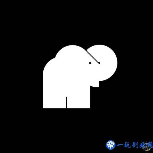
Raymond Bellemare设计的MC设备公司商标,1975年
MC设备公司的商标拥有愉悦的隐喻性,设计师将公司的实力根据小象呈现出来。
图形的3D渲染、大面积的添充和细丝的组合,使其有着立即的外观,但是在当时的男尊女卑行业里,它却拥有儿童故事书一样的质量,与众不同又不失平易近人的特性。
MC Equipment Inc by Raymond Bellemare, 1975
MC Equipment Inc’s logo stands out for its conviviality of metaphor – the strength and physicality associated with elephants applied to construction.
Its rendering, a combination of heavy fills and fine lines, gives it a graphic immediacy and yet, with its almost child-like story-book qualities, an approachable and distinctive quality within a typically technical and masculine industry.

Raymond Bellemare和Gilles Robert设计的Le Pussycat,1969年
该商标为影院而设计,Bellemare和Robert设计的Le Pussycat商标展现了它的才能,商标像一只猫,鉴别度很高。它3D渲染不同寻常,颜色添充均衡,除此之外,还有着协调的形状和占比。
象征性地说,商标拥有神秘的发展潜力:蜷曲、好奇心和舒适。
Le Pussycat by Raymond Bellemare and Gilles Robert, 1969
Designed for a cinema, Bellemare and Robert’s work for Le Pussycat is highly accomplished and identifiable as a cat. It is distinctive in its rendering, confident in its balancing of heavy fills, and has a satisfying geometry and proportionality.”
Figuratively speaking, it has mysterious potential: curled up, curious and cosy.
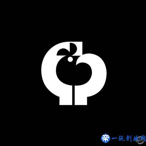
Patrick Dugast设计的Le Club de la Publicité de Québec,1974年
在策展LogoArchive Instagram时,设计师主要通过有力形式语言,以最小的方式得到较大的意义。
负空间是一种奇妙的方式。商标里的鸟从C和P的疏松3D渲染中而呈现出来。这种对黑墨水的敏感和图象的拓卜关联产生与众不同而难忘的标记特点。
Le Club de la Publicité de Québec by Patrick Dugast, 1974
When curating the LogoArchive Instagram account, I’m primarily looking for a strong use of form language, but also maximum meaning with a minimum of means.
Negative space is a fantastic way of doing this. Here, a bird is drawn out of the loose rendering of a C and P. This sensitivity to ink and the absence of ink – in the use of dual imagery – serves to establish a distinctive and memorable symbol.
版权声明:本文内容由互联网用户自发贡献,该文观点仅代表作者本人。本站仅提供信息存储空间服务,不拥有所有权,不承担相关法律责任。如发现本站有涉嫌抄袭侵权/违法违规的内容, 请发送邮件至 举报,一经查实,本站将立刻删除。


